Analyzing Breast Cancer Data using Orange
TASKS:
Dataset used : https://sci2s.ugr.es/keel/dataset.php?cod=97
Task-1:
Dataset Description using Orange tool.
What is need to be done to improve the accuracy of the classification result of the given dataset? Get the maximum classification accuracy possible by performing the following methods.
→Pre-processing
o Encoding
o Normalization
o Missing value handling
o Feature Selection
Compare your accuracy with and without applying pre-processing steps. Perform the Classification and visualize accuracy before and after preprocessing in Orange/Python.
Task-2:
Generate the Dashboard of the preprocessed dataset from task-1.
Find the Maximum data insights by plotting Bar chart, Boxplot, Pie Plot, Stack Plot using PowerBI dashboard visualization.
Answer The Following Questions:
1. Provide a screenshot of the data description and explain in brief.
2. Provide screenshot (s) of data pre-processing steps showing their significance.
3. Provide a screenshot showing accuracy before and after pre-processing.
4. Provide a screenshot of the PowerBI dashboard with a description.
SOLUTION
Firstly we will convert our .data file into a proper CSV file. For that, we will use colab. In colab, we use pandas to convert the dataframe properly to csv like:

Ans - 1) Dataset provided to us is of breast cancer which is hosted originally on http://archive.ics.uci.edu/ml/datasets/Breast+Cancer, this dataset deals with women’s age, tumor size, affected breast and its quadrant, when the menopause occurs etc.
Now, we will preprocess our data using the Orange3 tool present in Anaconda Navigator. I have created the following the data flow which does classification of the target variable ‘Class’ in the dataset using 2 parallel methods.

The area enclosed by the red marker below shows the path where data is not pre processed and it is given to classifier for classification. I have used KNN for classification here

The outputs obtained without preprocessing are as follows:

Ans - 2)Now, we will use the other path where we have used some preprocessing, i.e. the un-enclosed area in the data flow in image 3
Here, now firstly, we will eradicate the missing values using the Preprocess widget, next we will send it to a data table. Now since there are no missing values, we will use normalization to normalize the numeric fields present in the dataset.
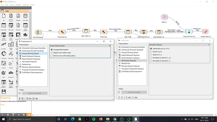
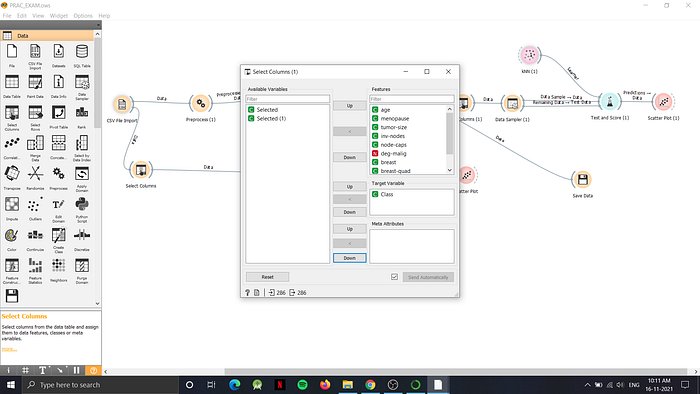
After the two preprocessing steps, now our dataset is more feasible for classification. Firstly, we will remove the ‘selected’ column which is added by orange using the select columns widget, and using the same widgetwe will assign the target variable like:
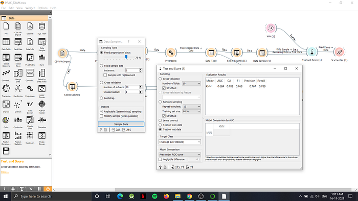
Next we will send this data to a data sampler which will divide dataset into 75% as data sample and remaining 25% as the remaining data.
After data sampling we will use the test and score widget available to us. In the test and score, we input the learner method of KNN and the dataset inputs from data table as shown in the dataflow earlier. Once the dataflow is complete we will open the test and score widget which will provide us the following output:
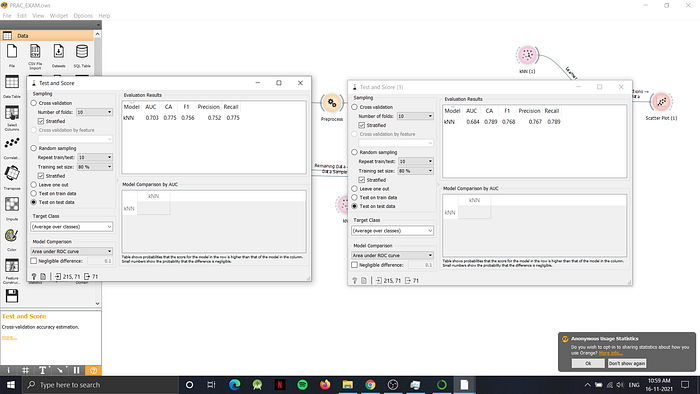
Ans - 3) The snapshot below shows the difference between the simple dataflow (on the left hand side) which is not pre-processed meanwhile the right hand side shows the output obtained after pre-processing the data. It is clearly visible that the CA, F1-score, Precision and Recall are better in the pre-processed data
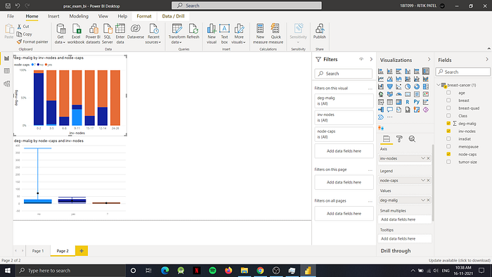
Now we will generate a dashboard for the dataset using Power BI. To generate the dashboard we will first generate reports in power BI app and then we will publish it to the workflow
The report pages contains graphs of: Pie chart, Bar chart, Stacked bar chart, Box plot, Area chart etc
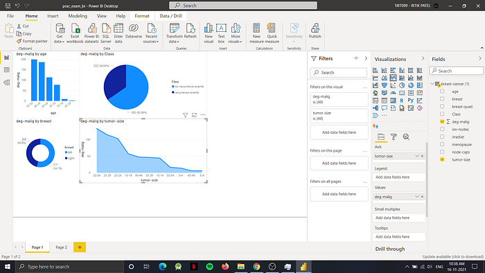
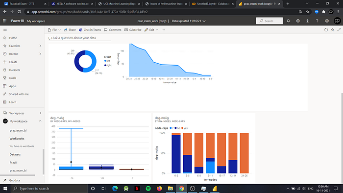
Ans-4) After publishing the report to power BI, we will login into app.powerbi.com, and then navigate to dashboard where we will pin the charts to generate the dashboard as follows:

That’s all for the tasks, thank you for reading! — Prepared by 18IT099 (Ritik Patel)